
How our current property downturn compares to past corrections

Over the past three months, I’ve met plenty of buyers who are in a position to buy. Their pre-approval is sorted, deposit is sitting in the account, and they are genuinely able to transact today. And yet they’re sitting on their hands, waiting for a “proper” downturn to hand them a bargain before they’ll move. When I ask what they’re actually waiting for, the answer is usually something vague about prices “having further to fall.” My view is that most of them will be waiting for a correction that simply doesn’t arrive in the size or timeframe they’re picturing.
Today’s blog covers how this downturn stacks up historically, why “the market” is a misleading phrase, and why some properties are far more exposed than others in this particular cycle.
This correction is ordinary by historical standards
Australia has worked through roughly eight completed housing downturns over the past three decades, and this is our ninth. On average, those downturns have trimmed around 2.9% off national values over about eight months, with recoveries that follow averaging a solid 32% over the next couple of years. Even the sharper episodes tell a similar story of resilience rather than collapse. The 2017 to 2019 credit crunch took national prices down about 8.5%, with Sydney alone dropping more than 14% over eighteen months, and it still fully recovered within a few years. (Source: Domain)
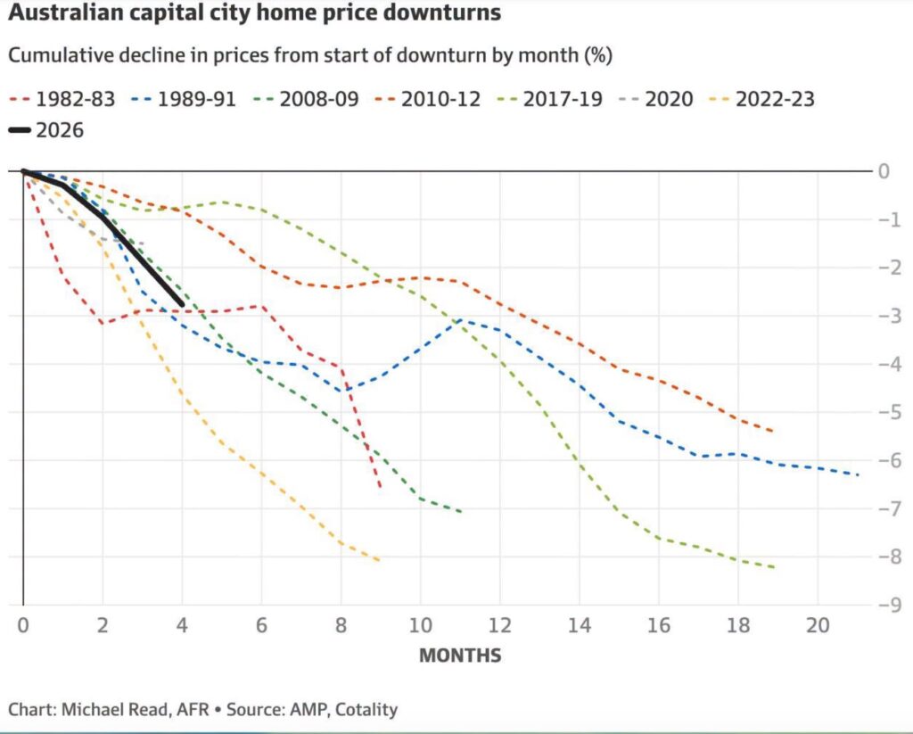
None of this points to the kind of sustained, sinister price falls some buyers are holding out for. I don’t believe we’re facing a downturn that is completely different in this cycle, and for Melbourne and our larger regional markets, I think we’ve already seen the bulk of the correction play out. Some will disagree with me, but the sharpest price falls I witnessed at my coalface were in the first four weeks following the budget announcement.
It’s also worth remembering that the index numbers we’re all reading are backward looking. Settlement-based data can lag the actual moment buyers and sellers agreed on a price by six to eight weeks, sometimes longer once revisions catch up. So a headline figure showing Melbourne still softening is often describing conditions from a couple of months ago, not what’s happening at auctions and in negotiations this week. Obviously, auction clearance rates are a good leading indicator of market health, but they aren’t the only indicator, (particularly in non-auction markets).
Sentiment on the ground can and does turn well before the published numbers illustrate it.
There is no single Australian property market
The other thing that gets lost in national headlines is just how differently individual markets behave within the same cycle. During that 1989 to 1991 downturn, Melbourne was flat, while Perth gained more than 30% in real terms over the same period.
A national percentage figure tells you almost nothing about what’s happening on your own street.
This fact stands today. Some regional markets are still recording gains while capital cities dominate the headlines about softer auctions and falling clearance rates.

It’s not a blanket fall, it’s a segmented one
Within Melbourne specifically, this downturn hasn’t touched every price point evenly. Owner occupier demand for well located, sensibly priced family homes has kept the renovated family home market reasonably resilient in the median price band. Yet unrenovated houses have arguably been worse-off with the harsh conditions. The impact of higher building costs has continued to plague the ‘renovator’ options on the market.
Interestingly, affordability and higher interest rates have influenced the lower segments of the market for owner occupiers, and we are now seeing established-property investors favouring the lower price points too. Melbourne is yielding 5%+ returns in the inner and middle ring apartment markets; a rental yield we haven’t seen in a long time. As a result, boutique apartments and villa units are not only holding reasonably firm, but showing growth.

It’s the upper quartile; the properties competing for a smaller, more discretionary pool of buyers, where I’m seeing genuine price vulnerability and where vendors are having to work harder to achieve a result. For the buyers who are shopping under the median, they’re operating in a very different market to someone chasing a premium renovator on a leafy street.
What shapes these cycles?
It’s also worth remembering how much of each downturn is either triggered, or exacerbated by policy rather than a cause which is purely organic. The 2017 to 2019 crunch was largely APRA quietly tightening (and restricting) investor lending. This time it’s a tough combination of consecutive rate rises and federal budget changes to negative gearing and capital gains tax, hurting investor sentiment and spooking owner occupiers.
What I’d tell my friends….
If you’re financially ready and you’re waiting for a crash that historical patterns suggest isn’t coming, you may be losing a buying opportunity. Opting for a longer wait and a smaller pool of good stock to choose from does not make much sense to me.
Focusing on the specific segment and suburb you’re targeting, rather than the national headline is highly recommended, because median national data is pretty useless when it comes to gauging specific growth drivers in a given suburb.